Greetings, everybody!
It’s now 2019! To celebrate, I have decided to completely overhaul the look of Flippin’ Fun Video Games! I am very proud of how this turned out and am excited to show it off!
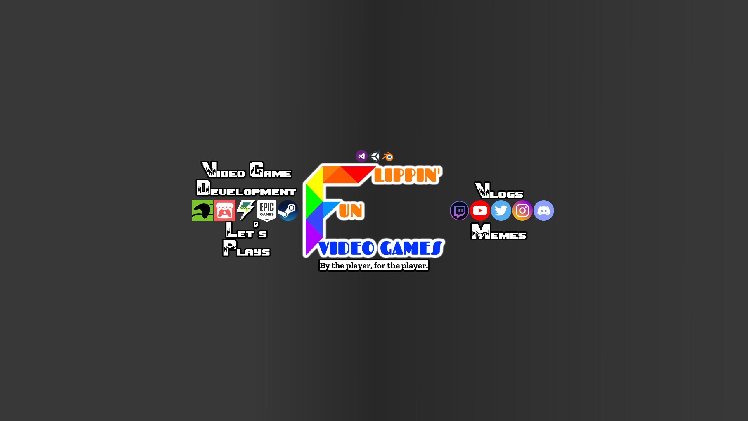
While I was designing this logo, I was inspired by the simplicity of minimalism and geometry. I used several triangles of varying colors to create the letter “F,” which symbolizes the company’s name. The color scheme was inspired by the color scheme of the previous logo, which were orange and blue. I decided to use variants of those colors, using light and dark shades of orange and blue to make the color combination less harsh to look at. Purple was added to the logo to make it look more vibrant and colorful. The inspiration for a large “F” came from medieval texts that emphasize the first letter on a page by making it larger and more decorative than the rest of the letters on the page. That and the procrastination episode of “Spongebob Squarepants.” The font in the logo came from my idea of how games should be; fun and appealing both to the developer and the player. The colors for the phrases again came from the previous logo’s theme of orange and blue.
The reason why I chose to update the look of the company just one and a half years after the previous rebranding is because I not only wanted to commemorate the first official day of my adult life, but I also felt that the previous rebrand was too similar to the first iteration of the company’s brand and that it didn’t stand out enough from other video game studios’ logos and color schemes.
I would like to thank all of you for supporting me and Flippin’ Fun Video Games. Without you, I wouldn’t be here today. Here’s to a Flippin’ Fun 2019!
-Michael Shaw, President/Founder of Flippin’ Fun Video Games